Why I don't have an Online Portfolio
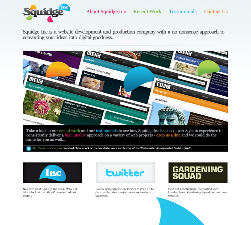
The first website I built for Squidge Inc Ltd was a pretty traditional affair - it had a slideshow of recent projects, client testimonials and a bit of background on the origins of Squidge Inc.

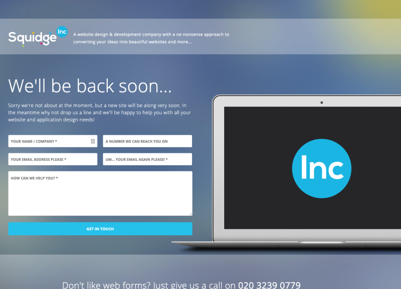
It aged very quickly, and although it was a reassuring web presence, when I rebranded I didn’t have the time to put together a complex multi-page site with case studies and the like, so opted for a rather simple contact form, and a ‘We’ll be back soon…’ message.

There’s a bit of a pattern I’ve noticed with one person companies, they can often talk about themselves in the plural, as if they’re bigger than they really are - giving the impression they’re a multi-person company. The use of ‘we’ peppered across multiple pages of content - showcasing past work, pages of content talking about services ‘they’ offer. Although I can appreciate this is better for some, over the years I’ve come to realise that I’m much better off being honest about Squidge Inc being ME not WE.
...over the years I've come to realise that I'm much better off being honest about Squidge Inc being ME not WE.
The Shift of WE to ME
I’m fortunate to get a lot of my work via referrals. As such, a lot of the individuals and establishments that want to work with me are wanting to work with ME not with a company that looks like it could any number of employees. With this in mind I approached the relaunch of squidgeinc.com through a different lens than I had previously. I’d focus on talking about myself as Squidge Inc. Using this approach I’m not trying to pretend to be anything bigger than one guy, trying to do some good in the world of UX, design and development.
...I'm not trying to pretend to be anything bigger than one guy, trying to do some good in the world of UX, design and development.
Making it clear that the company is me allowed me to also have clear links through to my personal LinkedIn profile as well as GitHub, Twitter and this blog - without things getting confusing.
I took the time to re-write my LinkedIn information to make it easy for any prospective clients to check me out properly - again, being honest about Squidge Inc being just me. I also made the decision to present testimonials using LinkedIn’s ‘Recommendations’. This is a proper, transparent way for clients to read what others have to say about me, and it’s a lot easier for me to maintain.
No more Online Portfolio
But why no portfolio, you may ask? Well again, I took a step back to think about exactly how I wanted to present myself to any prospective clients. Over the years I’d shifted my services to consultant, UX researcher, designer and developer - verses purely website development. As a result, after some consideration, there were several factors that I felt having an online portfolio would be less beneficial for me.
I didn’t want to make an assumption about the kinds of clients, or projects I want to attract. I enjoy working across quite a variety of sectors and use a wide variety of skills across various projects too. With this in mind, coupled with the fact that a LOT of my work is under NDA - meant that I decided I would focus on producing more ad-hoc examples of my work instead. The final point was that maintaining a portfolio to cover all of the skills I was potentially offering would be time consuming, and likely not have worthwhile engagement levels.
I didn't want to make an assumption about the kinds of clients, or projects I want to attract.
Ad-hoc Video Portfolio
The solution? Well I’m fortunate that I’ve always been quite confident in speaking about my work - so I did a few tests of a video-based ‘tour’ of some of my techniques and projects. I’ve found that they can be produced very quickly using a simple screen recording with a live voice over of me talking through a curation of project examples and techniques.
The beauty of this approach is that I can tailor my recording to the prospective client directly, mention them by name, and draw attention to things I feel are important for them to note. I can also clear any NDA-covered work if/when required, with the knowledge that it won’t be presented publically, and I can recall the video link after a given amount of time.
The beauty of this approach is that I can tailor my recording to the prospective client directly, mention them by name, and draw attention to things I feel are important for them to note.
I’ve had a really good response using this method of presenting my work. Prospective clients get to hear me talk about my approaches to projects, and get a far more tailored, curated experience vs having to read through case-studies, or look at some pretty UI that likely won’t have any relation to what they may ask me to work on for them.
Stealth UX Education
The by-product of using the tailored approach is that I also get to do a little bit of stealth education as part of this video introduction. The world of UX research, design and development can be very muddy for some, and I purposefully walk through my processes - detailing the importance of each stage, and providing examples of projects that have benefitted from them, specifically drawing comparisons to the project I’m pitching for/being asked to potentially work on.
It’s a bit of a different approach to presenting work - but I haven’t come across any client who hasn’t responded well to a video of me talking about how I could help them. In some cases I’ve been told it was the deciding factor for why they chose me over others who were in the running for the same project.
I haven't come across any client who hasn't responded well to a video of me talking about how I could help them.
The videos can vary in length, but I’ve found that people are willing to watch a longer video vs skim-read a portfolio document. It’s also a lot easier for them to share internally - and they actually get to know me a little more, hearing me articulate the reason why I’m (hopefully) going to be a good choice for their project.
I’m not saying that everyone should use this approach - or that static online portfolios are a bad thing to have. I’ve just found that this way of presenting my work, and how I can potentially help prospective clients, has worked very well, and may be worth considering.
 David Kidger is a UX / UI designer and developer. He founded