Building Labyrinth
Sorry, no David Bowie as the Goblin King or dancing to the ‘Magic Dance’ in this labyrinth - though the Jim Henson film is one of my favorites from my childhood!
The Labyrinth board game is played a lot in the Kidger household. The set-up of the game is fairly simple: playing as one of 4 coloured characters, you start at one corner of the board and have to collect a series of items presented on cards (dealt to you) that correspond to the same items randomly distributed though-out the labyrinth.
The tricky part is that each turn you have to ‘move’ the labyrinth by sliding one of the 3 columns or 3 rows of the labyrinth across by one tile, inserting a new path tile in the process. You can then move your player down the twisting labyrinth pathways to collect your next item, and get back to your corner to win the game.
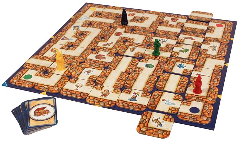
When playing with other people this means that the pathways are constantly shifting and changing as you play. The item you’re after can easily be moved out of reach - or your player can even be pushed off the board, making you teleport to the opposite side of the board!
It’s a really clever game, and given the random order and orientation of the labyrinth tiles, combined with the random items you have to collect, it is always a fresh challenge and can really scramble your brain trying to figure out how to navigate the shifting pathways.
The Inspiration
I’d often pondered if this game could be changed to a digital format, but the coding challenge behind it always felt out of reach. But I was sent a link to this amazing competition to try and build a game in 13k of code: js13kGames - there is some seriously impressive work on here, and suffice to say, my Labyrinth game is quite a bit more than 13k! But going through the page I came across Ania Kubów who does some great tutorials on developing games in Javascript, HTML and CSS. It was her tutorial on creating Frogger and the base code for moving a player through a grid play area that got my cogs whirring on Labyrinth.
Labyrinth for One
Before I journeyed too far down the rabbit-hole that would be the coding and design challenge of creating a digital version of Labyrinth, I had to devise how the rules would work for one player. As mentioned above, part of the joy/frustration/mechanics of the board game is the randomness of other player moves. I did toy with the idea of introducing a randomised labyrinth shift… but it felt odd to do that without context.
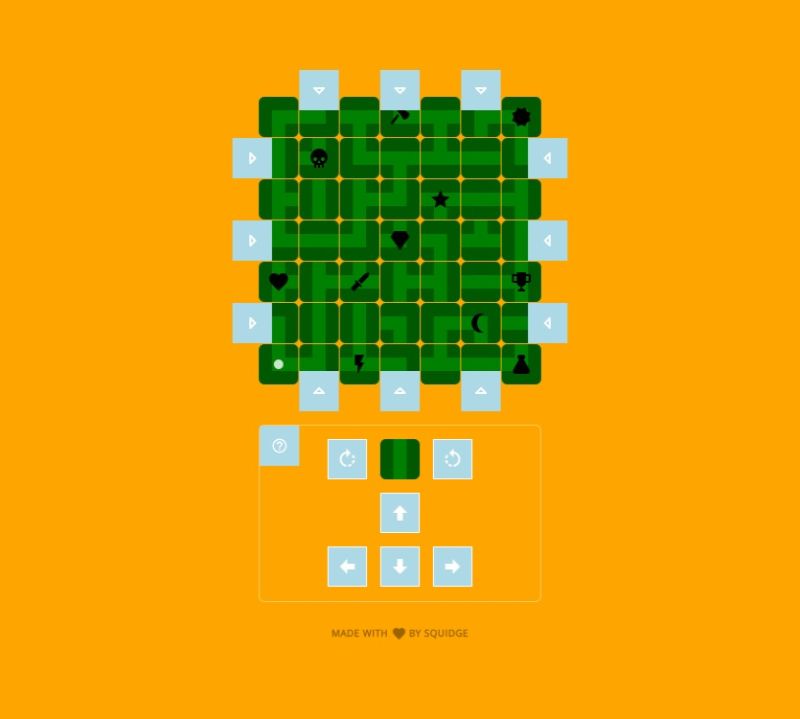
In time I realised that if there was a significant number of icons for the single player to collect (in any order they wished) then the shifting labyrinth and item collection mechanics would be kept intact and still enjoyable (if a little easier than the board game). I also decided to stop the player from simply shifting the same column or row multiple times (a similar rule exists in the board game too). I did start explore enforcing the move labyrinth THEN move the player mechanic, but realised quickly, that with one player this didn’t have to be there.
The process of ‘inserting’ a tile into the labyrinth would ideally be done by a drag and drop interaction - but this turned out to be one step further than my skills would allow (and may have been a little fiddly on phone screens anyway). Instead, I went with a series of white arrows around the edge of the board which indicate where the row/column of path tiles can be ‘pushed’ from - inserting the new tile in place with a nice, quick animation.
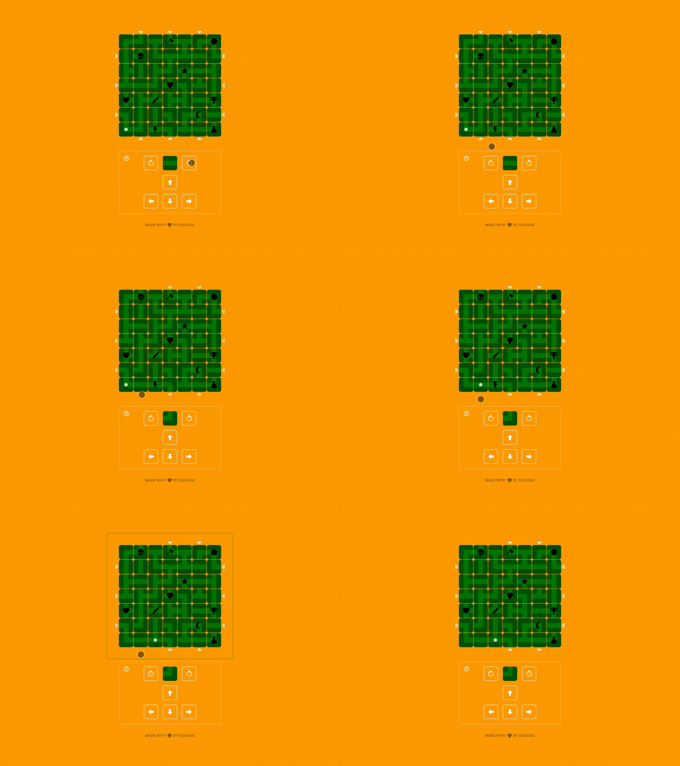
I added a completion time and the number of times the labyrinth had been moved which was shown when a player collected their last item. The player wouldn’t know these were being recorded when they first played as they would be learning the mechanics of the game the first play through. It seemed a little mean having a visible timer going the whole time as well! I also realised that as the labyrinth would be set in the same starting state for everyone, this would mean that players could try to beat their time/move count AND challenge other players to try and beat them as well.
When I play tested this approach it seemed to work very well for players, but I was made aware that the challenge was fairly limited given the same starting state of the labyrinth. My initial plan was to potentially give the option to ‘shuffle’ the labyrinth (which I may well still add). However, I decided to bring back a rule from the board game, where you have to collect your items/icons in the order of the card deck dealt to you - and you don’t know which item will be next until you have collected the current one. This became ‘Advanced Mode’ and would only unlock for players who had done their first play through.
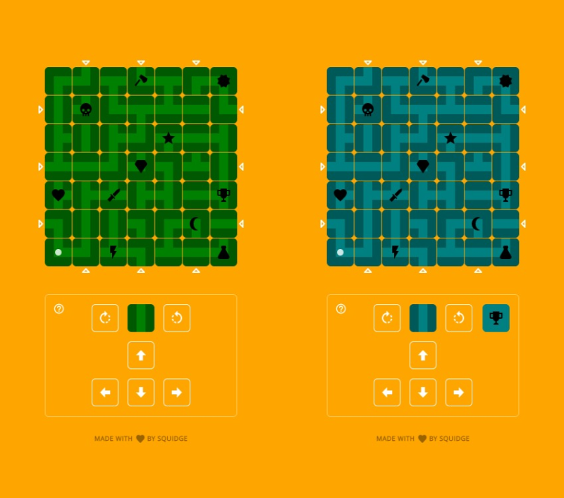
Advanced mode randomises the order in which the player has to collect the icons. As Advanced Mode would be different every time - as the player would collecting different icons, in a different order - the labyrinth would naturally shuffle itself differently - quite a neat solution (I thought!) and it seems to have gone down well since its release.
I also added in a link to a feedback form so that people could get in touch with thoughts or feedback when they had played through the game. Boiling down the help/introduction is still a work in progress, as the various mechanics are a little hard to describe in a few words. Most players seem to have got the hang of it though.
Design
The design was kept deliberately quite simple - the green and orange were actually just placeholder colours I used as I developed the game, but I grew quite fond of them, so left them in. Keeping the pallet deliberately simple seemed to work well, and kept the focus on the gameplay.
All of the interactive elements are at least 42px × 42px with space around each element to allow easy touch / click interactions. This was particularly important around the ‘shift’ arrows around the outside of the labyrinth but was also the case with the help button and the rotate/cursor keys.
Future Enhancements
I would like to explore the ‘shuffle labyrinth’ option, to give advanced players a truly random labyrinth challenge every time - but my grand plan will be to have a two player mode - where you may even be able to peak at your opponents tokens and try to block them… but that’s a whole other challenge!
If you haven’t already, the Labyrinth Game is live and free to play. It should work just as well on a desktop, tablet and smart phone. Though there are a few quirks on Apple touch devices when you can accidentally zoom into the screen with a quick double tap. This is actually a baked-in accessibility feature, that shouldn’t really be bypassed, so I’ll look into the best way to make this not interfere with the gameplay where possible.
Below I’ve gone into the more technical mechanics of how the game works, if you’re interested in such things.
Building the Board
The first challenge was to create a simple board, and get a player icon moving about the board. Given I wanted the game to work well on mobile I decided to make my tiles 42px × 42px - which with a 1px gap between each tile would give a labyrinth width of 300px - even a good size for a iPhone SE!
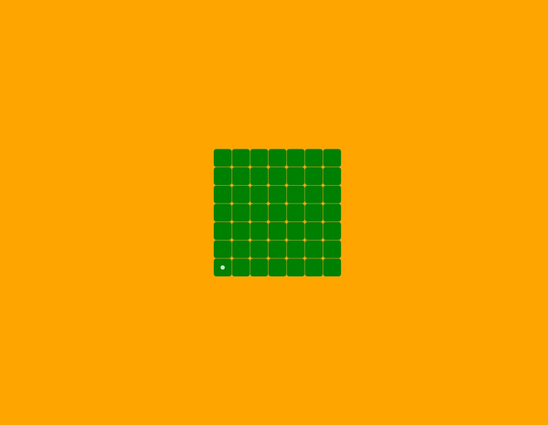
It doesn’t look like much, but this first version of the game board allowed me to move the player dot about the board freely via keyboard cursor keys, using the tips from the frogger tutorial. This version of the game wasn’t going to be very exciting to play though! The next task was to start styling the path tiles - and (somehow) get the logic working so the player dot would only move down the labyrinth paths…
Tile-tastic!
The Labyrinth path tiles are made out of 3 different types: corner, t-junction and straight. With these being able to be placed at any orientation this introduces just right level of random pathways on the board. The 42px × 42px tile size I’d chosen broke down nicely into 14px × 14px sub-squares into which I could draw the pathways, so they would match up perfectly next to one another, just like the board game. The player icon could be a nice neat 10px × 10px dot to have a nice gap between the pathway sides. I ended up creating each title type as a black SVG with a 30% transparency:

The board game has a number of fixed tiles that never move, and act as guides for the columns/rows that the user slides across when inserting a tile on their turn. I focused on building these fixed elements first - the semi-transparency allowing me to just choose a background colour (green was actually pretty random, but ended up being the one I stayed with) for the tile and the path would be automatically shown with the darker SVG sitting on top of it:
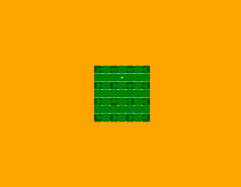
I’d never really noticed that (corners aside) the fixed tiles are all t-junction path tiles. This makes sense with the edges, but the shifting orientation t-junction tiles in the center of the labyrinth was an understandable design choice, only blocking one direction of entry.
Tile Style
I’d love to say that the code I’m showing below is where I started with the tile html/styling approach - but it took several revisits to get things as streamlined as I wanted. The tiles themselves had to be styled easily, and also have easy hooks so I could identify them with the javascript that was driving the player icon across the board.
<div class="tiles" id="maze">
  <!-- row 01 -->
  <div class="tile" data-type="corner" data-orientation="0"></div>
  <div class="tile column-01" data-type="corner" data-orientation="180"></div>
  <div class="tile" data-type="t" data-orientation="0"></div>
  <div class="tile column-02" data-type="corner" data-orientation="270"></div>
  <div class="tile" data-type="t" data-orientation="0"></div>
  <div class="tile column-03" data-type="corner" data-orientation="0"></div>
  <div class="tile" data-type="corner" data-orientation="90"></div>
  <!-- other rows follow the same pattern... -->
<div class="tiles" id="maze">
Using data attributes allowed me to easily get and set the various states of a tile, and in turn these styled the tile appropriately. Hopefully this is all pretty semantic… if you know the starting orientation of a tile of course!
// Our core tile styling
.tile {
 position: relative;
 width: 42px;
 height: 42px;
 background: green url(#) no-repeat center center;
 border-radius: 6px;
 overflow: hidden;
 opacity: 1;

// We create a pseudo element we can style independently
 &:after {
  display: block;
  content:'';
  width: 42px;
  height: 42px;
  background-position: center center;
  background-repeat: no-repeat;
  background-size: cover;
 }

// The type pulls in the correct SVG path graphic
 &[data-type="corner"]:after {
  background-image: url(/assets/tile-corner.svg);
 }
 &[data-type="t"]:after {
  background-image: url(/assets/tile-t.svg);
 }
 &[data-type="straight"]:after {
  background-image: url(/assets/tile-straight.svg);
 }

// The orientation independently rotates the pseudo element
 &[data-orientation="90"]:after {
  transform: rotate(90deg);
 }
 &[data-orientation="180"]:after {
  transform: rotate(180deg);
 }
 &[data-orientation="270"]:after {
  transform: rotate(270deg);
 }

}
Player Movement
Movement between the tiles then became a matter of identifying the path type and orientation of the tile the player was currently in, checking they weren’t trying to move outside the labyrinth boundary, then finding the destination path tile, and the path type/orientation of that tile, and confirming if the player could move outside of their current tile, and into the destination tile. The code snippet below shows the rules for this for when trying to move left, but a similar chunk of code was created for each directional move… phew!
var tile = maze[playerOnePosition];
var tileType = maze[playerOnePosition].dataset.type;
var tileOrientation = maze[playerOnePosition].dataset.orientation;

// Detect which cursor/on-screen cursor direction has been pressed
if(direction == 'ArrowLeft') {

 // Check that move doesn't take player outside of the labyrinth boundary
 if(playerOnePosition % mazeWidth !== 0) {

  // Remove the dot from the current position
  maze[playerOnePosition].classList.remove('player-one');

  var destinationTilePosition = playerOnePosition - 1;
  var destinationTileType = maze[destinationTilePosition].dataset.type;
  var destinationTileOrientation = maze[destinationTilePosition].dataset.orientation;

  // Identify valid routes out of tile
  if(
   tileType == 'corner' && tileOrientation == '90' ||
   tileType == 'corner' && tileOrientation == '180' ||
   tileType == 't' && tileOrientation != '270' ||
   tileType == 'straight' && tileOrientation == '90' ||
   tileType == 'straight' && tileOrientation == '270'
   ) {

   // Identify all valid routes into destination tile
   if(destinationTileType == 'corner'){
    if(destinationTileOrientation == '0' || destinationTileOrientation == '270') {
     playerOnePosition = destinationTilePosition;
    }
   }

   if(destinationTileType == 't'){
    if(destinationTileOrientation != '90') {
     playerOnePosition = destinationTilePosition;
    }
   }

   if(destinationTileType == 'straight'){
    if(destinationTileOrientation == '90' || destinationTileOrientation == '270') {
     playerOnePosition = destinationTilePosition;
    }
   }

  }

 }

}

// Update player position with class that adds the dot
maze[playerOnePosition].classList.add('player-one');
Moving the Labyrinth
This was the mechanic that nearly defeated me, but ended up having a fairly simple solution. The tricky issue is that at any given time you always have a spare tile, that the player can freely rotate 0, 90, 180 and 270 degrees - and they can choose to insert this tile into any of the 3 rows or 3 columns. This in turn will shift the selected row left/right or column up/down by one tile. I knew I wanted to have a clear animation to show this happening but also every single one of the tiles would have to be moved as well as the new one added, and one then pulled out as the spare tile for the players next labyrinth move.
Typing that out does make me realise that there are quite a few steps going on there. So breaking it down, lets assume the player has rotated their spare tile to the desired orientation. The next interaction will be to touch the row/column where they want that tile to be inserted. The ‘shift’ arrows, as I came to know them, are all marked up as follows, and have data attributes, just like the individual tiles:
<div class="shift" data-direction="up" data-column="column-01"></div>
<div class="shift" data-direction="up" data-column="column-02"></div>
<div class="shift" data-direction="up" data-column="column-03"></div>

<div class="shift" data-direction="down" data-column="column-01"></div>
<div class="shift" data-direction="down" data-column="column-02"></div>
<div class="shift" data-direction="down" data-column="column-03"></div>

<div class="shift" data-direction="left" data-row="row-01"></div>
<div class="shift" data-direction="left" data-row="row-02"></div>
<div class="shift" data-direction="left" data-row="row-03"></div>

<div class="shift" data-direction="right" data-row="row-01"></div>
<div class="shift" data-direction="right" data-row="row-02"></div>
<div class="shift" data-direction="right" data-row="row-03"></div>
A click event on these allowed me to identify if a row or column had been selected, and the desired direction:
if(event.target.matches('.shift') && !document.body.classList.contains('lockMovement')){

 // Identify which shifter arrow was clicked / used
 var shifterArrow = event.target;
 var direction = shifterArrow.dataset.direction;

 if(shifterArrow.dataset.row){
  var row = shifterArrow.dataset.row;
 }

 if(shifterArrow.dataset.column){
  var column = shifterArrow.dataset.column;
 }

 // Move the maze based on row and direction values
 if(row == 'row-01' && direction == 'right'){
  moveMaze('row-01-right', row01, swapperTile, 'right', 'row-01');
 }
 // ... other row rules ... //
 if(column == 'column-01' && direction == 'down'){
  moveMaze('column-01-down', column01, swapperTile, 'down', 'column-01');
 }
 // ... other column rules ... //

}
The moveMaze() function handled the magic for doing the correct animation, then shifting the correct tiles into the right place, adding the spare tile, and creating the new one. I did this by creating an initial array of the tiles in the column/row. The animation would take place, then the start/end array item (depending on the movement direction) would be taken and applied to the spare tile. I’d then add the new tile at the start/end of the array accordingly, and then re-write all of the new tiles in the row/column according to the new array. It had to be timed perfectly so that this happened after the animation, but with a bit of trial and error it’s a seamless change that you don’t notice, and the labyrinth tiles around the moved row/column don’t appear affected at all.
The Items/Symbols
Now I had all the mechanics working for allowing the player to move on the paths, and allow them to manipulate the labyrinth columns/rows - the final touch was to add the items, or ‘symbols’ as I call them in the game instructions. For these I referred to a trusted source for a large collection of icons I use all the time on projects: Material Design Icons - don’t be fooled by the name, this isn’t just the Google Material Design Icons… oh no, this is a vast collection of community created icons that have been added to the Material icon set.

I have yet to struggle to find a suitable icon in this set, and if there isn’t one, the community are very reactive to suggestions, and the set is being updated all the time.
Adding the icon to the tile was done by simply adding an additional data-token attribute to the tile html:
<div class="tile" data-token="7" data-type="corner" data-orientation="90"></div>The numbers go from 1-11 and correspond to a background image style that is added to the tile. When the player moves onto a tile, the code checks to see if it has a token and removes it if they’re playing Normal mode. In Advanced mode, the currently sought after token number is checked against the one on the tile, if it matches, we remove it and randomly select the next one for the player to find.
The Stack
As you’ve probably gathered - I only used pure Javascript, HTML and CSS to build this game project - no libraries or helpers (beyond that rather helpful navigation inspiration/code from Ania’s Frogger tutorial).
I’m on a bit of a mission to build my projects in as performant way as possible, so Jamstack is my go-to approach for creating super fast and reliable sites/projects (this very blog is built using Jekyll). Everything is in source control on GitHub (currently private… maybe I should make this project public?) and then auto-deployed/hosted statically on the wonderful Netlify.
That’s pretty much it. Creating Labyrinth has been a really fun project to play around with, and the feedback from players seems to indicate that I’ve got the right balance of challenge, replay-ability and fun. Have a play yourself, and let me know how you get on!
 David Kidger is a UX / UI designer and developer. He founded